Figure 1
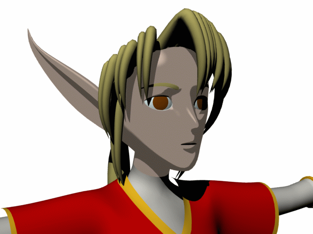
Figure 2
Note: When trying to decide how much "shadow" should cover a celshaded surface, consider studying actual traditional cel animations. If you have the means, study an actual cel. Find books with stills from animated features. Those with Web access can also search online for sites with pictures or even entire online cel galleries. Find a style of colors and shading that appeals to you, and see if you can recreate it in LightWave. (Some starting suggestions for color and shading reference: Iron Giant, Princess Mononoke, and Castle of Cagliostro).
STEP 1: Load kara01.lws into LightWave Layout. (If you did not follow the previous tutorial section, follow its first two steps now. If you have not yet followed any of the previous tutorial sections, you may load kara01.lws from the CD-ROM).
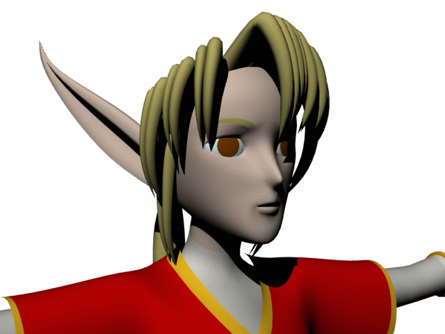
STEP 2: Go to frame 10. Move the Camera so that it has
a good view of our elf-girl's head and shoulders, and set a key for the
Camera at that frame. Go to Rendering > Render Options > Rendering
and activate "Ray Trace Shadows." Hit F9 for a test render. It should look
like Figure 1.
Pay attention to the areas of light and shadow on this object -- because
the Super Cel Shader will pay attention to them as well.
|
Figure 1 |
Figure 2 |
STEP 3: Go to the Surface Editor. First, make sure every surface listed under "kara03" in the Surface Name list has its Smoothing turned on in the Basic tab. Then select "Kara Face" from the list of Surface Names under "kara03." Go to the Shaders tab and select "LW_SuperCelShader" from the drop-down list called "Add Shader." Don't change its default settings right now -- instead hit F9 for a test render. It should look like...hm, it should look like Figure 2.
Note: When celshading, plan on using the default settings for the Super Cel Shader (or its LightWave 7.0 successor, BESM) about as often as you use the default Basic settings for a surface -- sparingly.
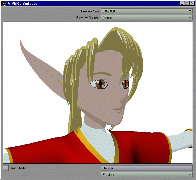
STEP 4: Time to get serious. In the lower-left corner of the Surface Editor, left-click on the button marked "VIPER." (If you can, indulge yourself a little and set its Preview Size to 640x480. If your machine balks at this, or if you don't have enough screen space for such a large window, or even if you just prefer faster feedback, you may leave it at the less-intense default setting of 320x240. Smaller sizes may give you faster feedback...but the larger size will let you see more shading detail). Hit F9 for another render -- and to give VIPER a chance to snag the information it needs. After the render has finished, left-click on the button marked "Render" in the VIPER window to load the render information into VIPER.
Let's place our shadows. Right now our elf-girl has too much shadow on her face (granted, the only light in this scene has been left at its default position, so the Super Cel Shader is not entirely to blame for this. Still, let's improve the way this surface interprets light and shadow).
STEP 5: Leave the VIPER window open, so that you can see what's going on. In the Shaders tab of the Surface Editor, double-click on "SuperCelShader 2.13" to go into its options. First, set the Brightness of Zone 3 to 100%, so that it has the same shading as Zone 4. That brightened things up a bit, but the contrast between light and dark now looks harsh. Lighten the shadow by raising the Brightness settings of Zones 1 and 2 to 85%. Better...but the shadow still covers too much of the face. Decrease the Max value of Zone 2 to 20%. Okay, but the 25% difference between the Max of Zone 2 and the Min of Zone 3 makes the border between the two look soft. If the amount of softness remained consistent along the entire border, it might pass for the look of modern digital ink-and-paint packages. As it is, the amount of softness increases as the border stretches towards the ear, and decreases as the border runs towards the chin. An even more rounded and stylized character might have been able to get away with a soft border between shadows. For our elf-girl, however, set the Min value for Zone 3 to 20%. Now the shading jumps immediately from Zone 2 to Zone 3, and the borders now look distinct. Your Super Cel Shader settings should now look like this:
Zone 1 Diffuse: Max: 0.0%
         Brightness: 85.0%
Zone 2 Diffuse: Min: 0.0%
                Max: 20.0%
         Brightness: 85%
Zone 3 Diffuse: Min: 20.0%
                Max: 95.0%
         Brightness: 100.0%
Zone 4 Diffuse: Min: 100.0%
         Brightness: 100.0%
STEP 6: Now that we have placed our shadows, let's try to fine-tune the color of this surface. It looks a bit too bright. Exit the Super Cel Shader interface, and return to the Basic tab of the Surface Editor. Change its Color to RGB 170 151 141.
Note: If you think this color looks a bit subdued, you are correct. The lower saturation makes the rendered surface even more video-friendly (and, for some printers, perhaps more printer-friendly). Various television standards do not take kindly to highly saturated colors. Pure reds, magentas, and blues (which may look fine on a computer monitor) tend to smear when converted to a video signal (ie: RGB 255, 0, 0). As a rule-of-thumb, keep RGB values between 20 and 235 when creating content for video.The lower saturation also attempts to mimic the look of an older cel animation that actually used cels. When trying to mimic the colors of older cel animations, keep in mind that while the ink went on the top of the cel, the paint went on the back of the cel and was seen through the cel. If you have ever seen transparencies from the local office supply store, then you know that the "clear" plastic of a transparency slightly desaturates the color of surfaces seen through it. The same thing happened with traditional cels.
That said, don't ever feel as though you must imitate palettes of the past. Always use the colors that you think look best. (Even the most zealous of cel animation fans should take note that modern digital ink-and-paint packages allow cel artists to use any color that they want -- along with special effects normally associated with "CG," such as motion blur!)
Tip: When trying to match the look of cel animation, consult books on color and on cel animation for tips, and use a color picker on frame grabs of a specific cel animation that you want to match.
STEP 7: This face has no texture maps on it, so its surface settings can double as the settings for the "Kara Skin" surface as well. In the "Surface Name" list, right-click on "Kara Face" and select "Copy" from the drop-down list that appears. Then select "Kara Skin" from the "Surface Name" list, right-click on its name, and select "Paste" from the drop-down list that appears. You have just copied all of the settings for "Kara Face" onto "Kara Skin."
STEP 8: The "Kara Silk" surface should have the same Super Cel Shader settings as "Kara Face," if its shadows are to line up. However, LightWave 6.5 cannot copy shaders from one surface to another.
Note: LightWave 7.0 can copy and paste shaders from one surface to another. The following steps are for those working with LightWave 6.5, but 7.0 users may copy and paste the shader itself, rather than the entire surface setting.Use the fastest method that gives you the best results.
Adjusting ten Super Cel Shader settings seems less convenient than writing down and later adjusting three RGB settings, so select "Kara Silk" from the list of surfaces and write its current RGB settings down on a piece of scrap paper.
Tip: If you are using the Color picker that comes with LightWave and happen to be short of scrap paper, consider this trick. Use the "Add to Custom Colors" button to temporarily store the RGB values of the "Kara Silk" surface in one of the squares listed under "Custom colors" in the lower-left hand corner of the Color panel. You can later left-click on that square to load those RGB values back into the surface.
STEP 9: The settings for "Kara Face" should still be listed in memory, so right-click on the selected listing for "Kara Silk" and Paste the settings for "Kara Face" -- Super Cel Shader and RGB values alike -- into "Kara Silk." This elf now looks ready to start shivering, so change the RGB values of "Kara Silk" back to their previous values. Or, change them to something new altogether. Try RGB 200 216 216 for a blue-white look.
STEP 10: Now for the hair. The rounded form of the hair geometry lends itself well to celshading...and shading tricks. If you want to keep the color you picked while modeling, write down the RGB values of "Kara Hair" onto paper. Then Copy and Paste the settings of one of the celshaded surfaces onto the "Kara Hair" surface. It now has Super Cel Shader settings that match that of the other celshaded surfaces, but the wrong color. Change its RGB values to the ones it had before the Copy and Paste operation, or to any hair color that you like.
STEP 11: This might look fine right now, but the shading doesn't do much to distinguish one hair tuft from another. To see how the following trick will work, go into the Shaders tab and remove the checkmark next to "SuperCelShader 2.13" to deactivate it (you can reactivate it later). Return to the settings listed under the Basic tab, and left-click on the "T" button next to Diffuse to enter the Texture Editor for that setting. Change the available Layer Type to Gradient, then change the Input Parameter to "Incidence Angle." Left-click near the bottom of the gradient bar to create a new key at the very end, and set its Value to 0.0%. Now the hair surface will receive 100% of all light at its edges and 0.0% of all light that hits those polygons that face the camera directly, with a gradient for everything in between. Click on "Use Texture" to exit this panel. Return to the "Shaders" tab and reactivate the Super Cel Shader by replacing its checkmark. The hair now appears to be "rim-lit." Return to the Texture Editor, and raise the Value of the key at the bottom to raise the amount of "rim lighting" on the hair. Stop when it looks good to you.
STEP 12: Let's add a specular highlight to this hair. Make the hair 100.0% Specular, with 19.0% Glossiness. Then go into the Super Cel Shader settings. To get a hint of how the Super Cel Shader thinks, deactivate "Specular Highlights" to see the "normal" LightWave specular highlights. Super Cel Shader interprets specular highlights in the same way that it interprets shading -- it simplifies what it "sees." Here, Super Cel Shader looks at the intensity of the existing specular highlight.
The Min and Max default to 30% and 50%, respectively. Their default settings mean the following in English: "Any pixel that has a specular highlight with an intensity of 50% or higher shall have an opaque shade of color representing cartoon specularity. This shade of color shall be specified by the Brightness and Saturation settings. Any pixel whose specular highlight intensity ranks as less than 30% shall not have a cartoon specular highlight. All pixels inbetween shall have a blend of the specular highlight color with the surface colors underneath, with their specular highlight opacity increasing with the amount of specular intensity."
In layman's terms, Max sets the range of solid "paint," and the difference between it and Min will set the falloff of that paint. The Min value must be the same as or less than Max. The larger the difference between Max and Min, the softer the edge of the specular highlight. If their values are the same, you will get a hard edge to the highlight.
STEP 13: Turn Specular Highlights back on. Set both its Min and Max values to 90.0%. It now has a hard edge to its border. The Specular Highlights "paint color" is itself a shade of the hair color -- its "Brightness" value acts the same as do the Brightness values for the Zones. The Saturation value is a nice touch, though -- set it to 10.0% to further grey out the paint, and make it look more off-white than yellow. To set off the brightness of the highlight paints, further darken the Brightness of Zones 1 and 2 to 70%.
STEP 14: Copy and Paste the settings for "Kara Hair" onto "Kara Eyebrow." Reduce the specularity for "Kara Eyebrow" to 0.0% to prevent odd-looking specular highlights from appearing on the eyebrow. The face has the same shadow borders as defined with the Super Cel Shader's "Min" and "Max," but it does not have a gradient in its Diffuse channel. If you want the eyebrow's shading to perfectly match that of the face, remove the texture from its Diffuse channel.
STEP 15: Now for the eyes. Copy and Paste the settings for "Kara Silk" to "Kara Eye White," and tweak to taste. For example, increasing its Zone 2 Max setting to 70% (this will automatically update Zone 3's Min setting to 70% as well) will increase the amount of "shadow" on the eye whites.
STEP 16: Copy and Paste the settings for "Kara Eye White" to "Kara Iris (Left)" and "Kara Iris (Right)." Eep, scary! Change their Colors to anything you like.
STEP 17: Not bad, but she's starting to look like one of the characters from Revolutionary Girl Utena. Go into the Color texture channel for "Kara Iris (Left)." It should already be set to "Image Map" for its Layer type, so all you need to do is specify an actual image. From the drop-down list next to "Image," select "(load image)." Load iris1.png from the CD-ROM. Texture Axis should be set to Z. Click on "Automatic Sizing" to fit this image to the size of the iris. Turn off Texture Antialiasing (otherwise this image will look "fuzzy" when rendered) and set both Width Tile and Height Tile to "Edge." Click on "Use Texture" to exit the Texture Editor.
STEP 18: Copy and Paste the settings for "Kara Iris (Left)" to "Kara Iris (Right)." Then go into the Color texture channel for "Kara Iris (Right)" and click on "Automatic Sizing" for the only layer in there, to fit the image to the geometry for the right iris.
Note: The geometry of these irises angle outwards, and do not point straight forward. However, because of the way planar image mapping works, this character will not have the spaced-out, dumbfounded look of The Simpsons' Homer Simpson whenever she looks straight at the camera. Her irises may look slightly oval, as will any disc when viewed from an angle, but that will be all. Planar image mapping distorted this image map in such a way that it looks flat when viewed from straight on, even though the geometry tilts away at an angle.
STEP 19: Now for the mouth. It doesn't need that much paint in it -- in fact, let's try going with a single shade of "paint." Simplest way to recreate a flat shade of paint is by setting the Luminosity to 100%, and the Diffuse to 0%. No need for the Super Cel Shader at all. So, set the Luminosity for "Kara Mouth (Interior)" to 100.0%, 0.0% Diffuse, with a color of RGB 150 100 090.
STEP 20: Select "Kara Eye Socket" from the Surface Name list. It, too, doesn't need Super Cel Shader -- "Kara Eye Socket" represents ink, not paint. Make it 100.0% Luminous, 0.0% Diffuse, and give it a color of RGB 030 024 039 for a violet-black "ink."
Your VIPER window should now look similar to Figure
3.
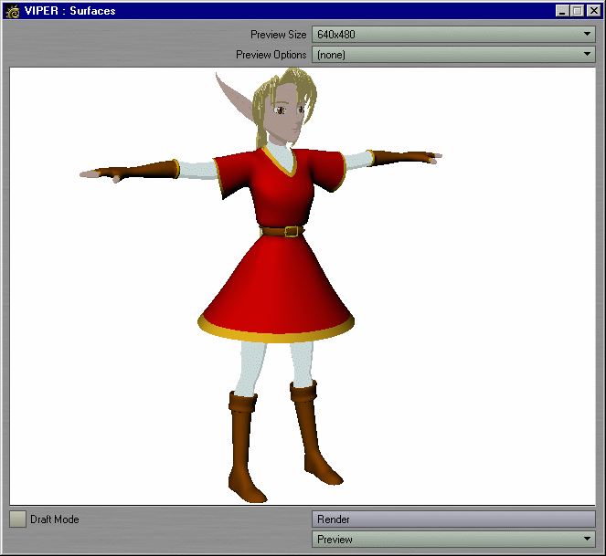
Figure 3 |
Figure 4 |
STEP 21: Go to frame 20. Move and Rotate the Camera so that you have a full-figure view of the elf-girl, and set a key for the Camera at that frame.
STEP 22: Type F9 for a test render. After the test render has finished, click on the "Render" button in VIPER to load the render information into VIPER. It should look like Figure 4 -- a curious sight, half-celshaded like that.
STEP 23: Let's continue the line of shadow from "Kara Silk" to "Kara Skin" through "Kara Glove" and "Kara Glove Trim." Copy and Paste the settings from "Kara Silk" to both "Kara Glove" and "Kara Glove Trim." Then set the colors of "Kara Glove" and "Kara Glove Trim" to whatever you like. (Those in a hurry can just set "Kara Glove" to RGB 128 060 040 and "Kara Glove Trim" to 200 150 060).
STEP 24: Reduce, reuse, recycle. Copy the settings for "Kara Glove," and Paste them onto the other brown surfaces in this model: "Kara Boot," "Kara Belt," and "Kara Ponytail Holder." Then Copy and Paste the settings for "Kara Glove Trim" onto "Kara Belt Buckle."
STEP 25: The boots could stand a little more shading. Go into the Super Cel Shader settings for "Kara Boot," and increase the Max of Zone 2 to 50%.
STEP 26: Only two more surfaces to go. Select "Kara Tunic" from
the Surface Name list. Activate the checkbox next to "Double Sided" to
make it a double-sided surface, and change its color to RGB 168 050 071.
Apply Super Cel Shader and go into its options. Try these settings:
Zone 1 Diffuse: Max: 0.0%
         Brightness: 67.0%
Zone 2 Diffuse: Min: 0.0%
                Max: 20.0%
         Brightness: 67.0%
Zone 3 Diffuse: Min: 20.0%
                Max: 99.3%
         Brightness: 100.0%
Zone 4 Diffuse: Min: 99.3%
         Brightness: 130.0%
STEP 27: Copy and Paste the settings from "Kara Tunic" to "Kara Tunic Trim." Set the color of "Kara Tunic Trim" to RGB 182 146 078.
STEP 28: That should be it for celshading. Time to save your work. Select kara03:Body from the Current Item list, and use File > Save > Save Current Object to save it as kara04.lwo. Because it is a layered object, all layers of this object will be saved along with it under the name of kara04.lwo. Type F9 for a test render. She should now look like Figure 5.
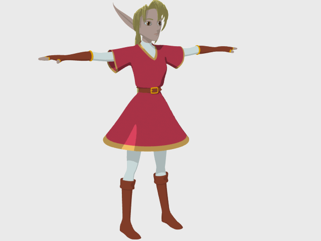
Figure 5
Tip: If you have created a separate scene file that has just the object and its Edges, then you can load items from that scene with all of their Edges applied into the scene of your choice.
STEP 29: Go to frame 10, which has a close-up of your character's head and shoulders. Select kara04:Body from the list of objects, and type p to enter the Item Properties for that object. Left-click on the Edges tab to see the options available. Because every type activated will open up opportunities for an unintentional ink line, we want to use the fewest types of edges that gives us the results we want. For kara04:Body, activate Silhouette Edges and Surface Borders. To make the ink line thinner for Surface Borders, set the value for Surface Borders to 0.5 pixels. To lighten up the ink line slightly, change the Edge Color to RGB 030 024 039.
STEP 30: Hit F9 for a test render. It might look like Figure
6. If you're using the model from the CD-ROM, notice the
strange heaviness of the ink around the inside of the eyebrow. An unwanted
Silhouette Edge lies there, because it sees an edge turning away from the
camera.

Figure 6 |

Figure 7 |
STEP 31: Let's try to "smooth out" this model by going to the Geometry tab increasing its Render SubPatch Level to 6. Type F9 for a test render (Figure 7).
STEP 32: Almost perfect. If the lines still look unartistically
uneven, though, you might be seeing one too many of all possible Edges.
If so we have one final weapon: Edge Z Scale. Set the Edge Z Scale to its
maximum of 1.0. Type F9 for a test render, and the lines should look more
even, since we're seeing less of them. (Figure
8)
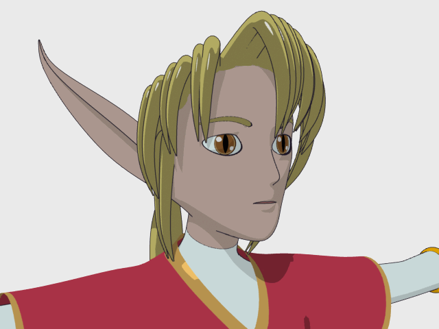
Figure 8 |
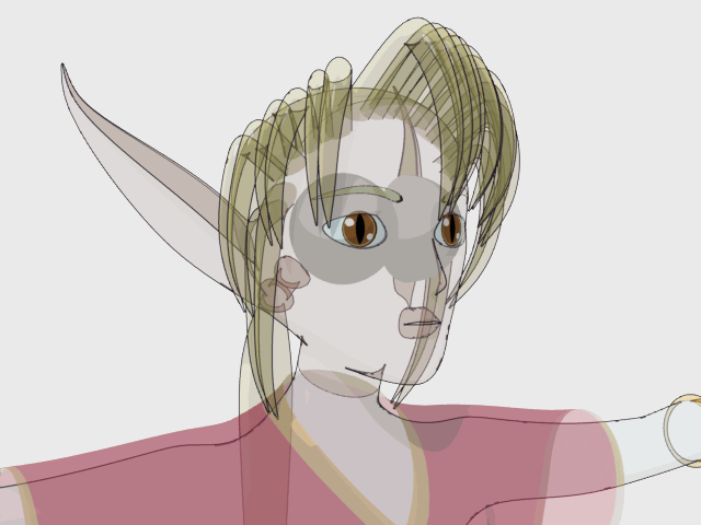
Figure 9 |
To see all Silhouette and Surface Border Edges in this situation, set the Object Dissolve in the Rendering tab to 50% for both kara04:Body and kara04:Tunic, and type F9 for a render. It should look like Figure 9.
Observe, and realize this: LightWave has no artistic sense, any more than does a pencil, pen, brush or chisel. LightWave, a logical thinker, follows two rules. Opaque surfaces conceal Edges. Transparent surfaces do not. Look at the line of the arm under the tunic. When the tunic was opaque, you could not see this line. Yet there it was, all along, because it met the qualifications for Silhouette Edges. (Some of these lines, such as the ink lines of the ear, are still hidden behind the opaque surfaces of the eyes. An object Dissolve of 50% on each of the eyes would make those hidden ink lines visible, too).
Reducing the Edge Z Scale makes more of these lines visible, by bringing all of them closer to the camera. It works the other way around, too -- increasing the Edge Z Scale hides more of the lines by pushing all of them away from the camera and further into the concealing opaque mesh of the elf-girl.
Set the Object Dissolve in the Rendering tab back to 0% for both kara04:Body
and kara04:Tunic. Then go to the Edges panel for kara04:Body and set its
Edge Z Scale to its minimum of 0.0, forcing it to reveal all of the lines
possible for this object. Type F9 for a render. It should look like Figure
10.
Figure 10 |
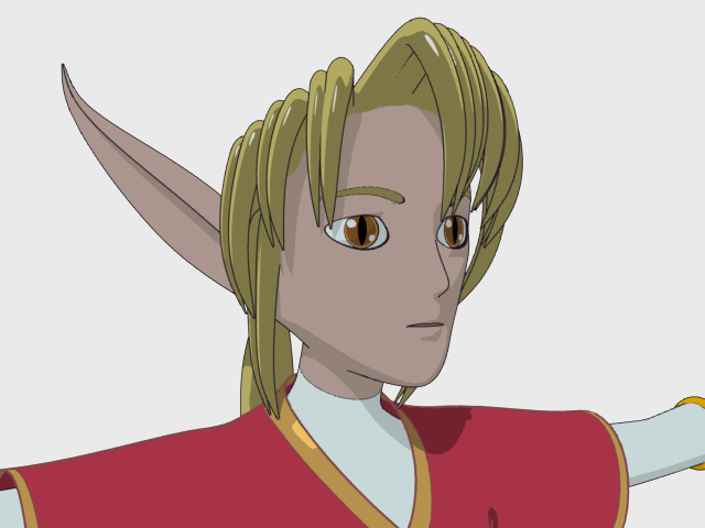
Figure 11 |
Set the Edge Z Scale back to 1.0. Let's take care of the tunic.
STEP 33: Make kara04:Tunic the current object. Activate Silhouette Edges (for the belt and belt buckle), Unshared Edges (for the ends of the sleeves), Surface Borders (to draw lines at the border between the "Kara Tunic" and "Kara Tunic Trim" surfaces) and Sharp Creases (for everything else). For fun, set the Edge Color to RGB 124 071 072. Set Unshared Edges to a thickness of 2.5 pixels and Sharp Creases to 2.0 pixels. Hit F9 for a test render. It should look like Figure 11.
STEP 34: Go to frame 20, where you have a full-figure view of
the elf-girl in the Camera View. Let's see how the Edges look at this distance.
Type F9 for a test render. It might look like Figure
12. The ink line for the top of the belt is showing through
the belt buckle, so if we wanted to animate this elf-girl at this distance
from the camera, we might have to slightly increase the Edge Z Scale of
the tunic to hide the unwanted ink line. Too high of an increase might
cause the thicker ink lines to break up as they get pushed into the concealing
mesh of the opaque tunic. For this distance, set the Edge Z Scale to 0.999
or something higher than 0.998 but less than 1.0 -- enough to "fix" the
belt buckle without hurting the thicker ink lines.
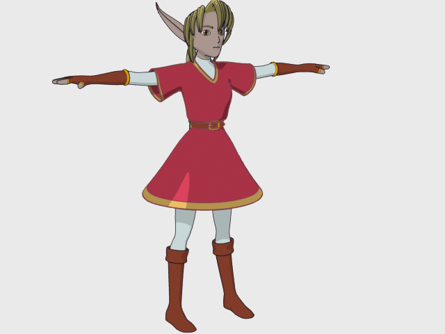
Figure 12 |
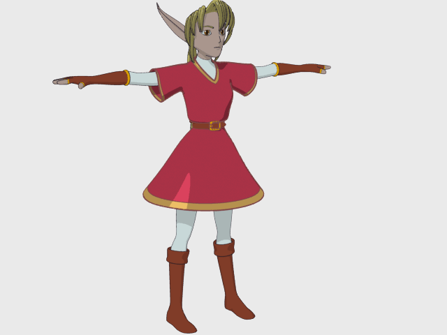
Figure 13 |
STEP 35: At this distance, the thickness of the edges around kara04:Body look a bit "heavy." They're still the same thickness as they were when seen up-close to the camera. Make kara04:Body the current object. In the Edges tab of the Object Properties panel, activate "Shrink Edges With Distance." Tell it to start making the edges shrink with distance once the model is more than 3 meters away from the camera by setting the Nominal Distance to 3m. Hit F9 for a test render. It should look like Figure 13 -- the ink lines will look thinner and thus "lighter" for the figure at this distance.
Experiment with the lighting in this scene to see what looks best with Super Cel Shader -- a spotlight might give you even more rounded shadows, for example.
As for the other Super Cel Shader buttons...
When activated, "Use Light Colors" means that the lights in the scene can cast their colors upon the celshaded surface just as they can with a noncelshaded surface. (The Zones still control and simplify the shading). This could help create the illusion of someone spraying a single color of paint on top of each shaded cel with an airbrush. For example, an orange point light with falloff, parented to the tip of a candle, would cast orange color onto nearby characters. A green point light, hidden inside a glowing globe, could recreate the evil entity from Heavy Metal, casting green color onto all characters nearby.
When activated, "Bumped Edges" puts a gradient "ink line" on the celshaded surface. "Limit" controls the falloff; "Strength" controls the opacity. It's angle-based, which makes it difficult to use on an unevenly angled surface (such as a hand). However, as a surface property, it will show up in reflections (unlike Edges). On extremely rounded characters, it might look fine. On complex characters (such as our elf), it will probably not behave like a hand-drawn ink line during animation. A tiny amount of angle-based inking might be used to supplement Edges (by giving an illusion of thick-to-thin, tapered ink lines), but for most animations it cannot replace the hand-drawn behavior of Silhouette Edges. Test it to see if you like it.