STEP 1: Open LightWave Layout. Load kara03.lwo into Layout. (If you have not built kara03.lwo from the previous tutorials, you may load her from the CD-ROM). We want to clearly see all of the dark ink lines that we will use, so set the Backdrop Color (Scene > Effects > Backdrop) to RGB 255 255 255. We also want the lighting to look as dramatic and "cool" as possible, so set the Ambient Intensity (Lights > Global > Amb Intensity) to 0.0%. (Ambient Intensity lighting tends to "wash out" most of the shadows on an object, celshaded or not. The Super Cel Shader interprets and simplifies shading -- it cannot add shading).
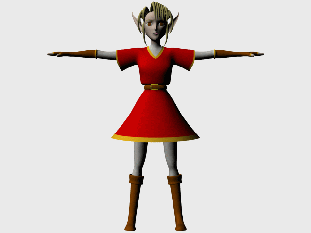
STEP 2: We want as good a view of the subject as possible. Increase the Camera Zoom and move the camera so that the model fills the entire Camera View. Set a key for the camera and tap F9 for a test render. It should look something like Figure 1. Save this scene file as kara01.lws.
STEP 3: Open up the Surface Editor. Select "Kara Glove" from the list of surfaces in the Surface Name column. From the Shaders tab, select LW_SuperCelShader from the "Add Shader" drop-down list. "SuperCelShader 2.13" will be added to the list of shaders applied to this surface, and the formerly soft, gradient shading on the preview sphere will be simplified into three shades of brown. Hit F9 for a test render if you wish -- notice that Kara's gloves now render with only two or three shades of brown.
STEP 4: Double-click on "SuperCelShader 2.13" to bring up its options panel. Ignore "Use Light Colors," "Specular Highlights," and "Bumped Edges" for now. Just focus on the ten sliders at the top -- the ones listed under Zones 1-4. It may seem like a lot of sliders...but notice that each slider controls one of three settings: "Min," "Max," and "Brightness." Also notice that the ten controls fall into one of four "Zones" -- Zone 1 Diffuse, Zone 2 Diffuse, Zone 3 Diffuse, and Zone 4 Diffuse.
STEP 5: Let's experiment with "Brightness" for now. Each of the four Zones has its own Brightness setting. Note that though four Zones exist, the sphere appears to have only three shades of brown on it. Then note that the Brightness for Zone 1 happens to have the same setting that of Zone 2 -- a value of 40.0%. Left-click on the Brightness slider for Zone 1 and replace that 40% value with different numbers -- all the while keeping an eye on the preview sphere. Try setting Zone 1's Brightness to 0%; then try setting it to 100%. You should see the darkest band of shading on the preview sphere split up into two adjacent bands, as Zone 1 reveals its location by getting brighter and darker with higher and lower Brightness values. Try adjusting the Brightness settings for the other three Zones in the same way -- note that the shading of each Zone gets lighter or darker with higher or lower Brightness settings.
Yet no matter how many times you adjust the Brightness settings, the Zones always stay the same size. The Brightness setting for each Zone controls how light or dark that shading appears...but what controls the amount of shading? What controls the size of a Zone on an object?
You guessed it -- those other two settings: Min and Max.
STEP 6: Let's experiment with the "Min" and "Max" settings. Increase the "Min" value next to "Zone 3 Diffuse" to 60.0%. You should see the middle border of the shading (the border that separates Zone 2 from Zone 3) soften into a gradient between the two. Now increase Zone 2's "Max" value to 60% (if you use the slider and accidentally go over 60%, notice that the "Min" value for Zone 3 will increase along with Zone 2's "Max" value). With Zone 2's "Max" set to the same value as Zone 3's "Min," the border between the two hardens, becoming crisp and distinct.
The bigger the difference between the Max of a lesser Zone and the Min of a greater Zone, the softer the border between them will be (think of airbrushing, or the digital blending between the shades of color on the characters' skin in Dreamworks' Prince of Egypt). The smaller the difference, the harder the border between them will be (think of the hard distinctions between shades of color on most hand-painted cels, such as those used for older Japanese animated television shows).
Differences greater than 0%, however, risk the look of "smudged paint" between Zones on some models. If the model has indistinct areas of light and shadow upon any part of its surface (whether due to lighting or to an uneven, slightly "bumpy" surface), consider making the Max value of each Zone equal to the Min value of the next higher Zone. This restricts you to "hard" borders, but it may be preferable to have "hard" shading than unattractive shading.
The English translation for a Zone that has a Min of 10%, a Max of 35%, and a Brightness of 80%: "If the pixel in question receives an amount of light between 10 and 35 percent, then said pixel will render as though it receives 80 percent light."Alternate English translation for a Zone that has a Min of 10%, a Max of 35%, and a Brightness of 80%: "If the pixel in question is between 10 to 35 percent lit, then the RGB values of that pixel will be multiplied by 80 percent. For example, if the pixel in question is between 10% and 35% lit, and that pixel's color values are RGB 100 200 50, then it will render with an RGB value of 80 160 40 -- 80 percent of each red, green and blue channel in RGB 100 200 50."